Luxe Beauty Pros. Admin Dashboard
Design of the business management dashboard for a beauty service startup

Overview
Last summer, I interned at Luxe Beauty Pros, a startup for on-call beauty services. I was responsible for designing the Business Management Dashboard for the startup. The dashboard had different elements like Point-of-Service (POS) system, Professional Management, CRM system, Analytics with multi-tier users.
Role
User Research, Wireframing, Prototyping, Cross-functional collaboration, Communication
Team Members
UX Team at Luxe Beauty Pros.
Tools
Miro
Notability
Sketch
Adobe AfterEffects
Duration
4 months
Note: Majority of the process followed and deliverables are redacted due to confidentiality. Please feel free to contact me to know the design details of the novel features.
MY ROLE
End-to-end design
I was in charge of designing the home page, calendar, and the POS system independently and collaborating with the Product Managers and the Development team to finalize the designs. The design process followed consisted of user research, competitor analysis, designing the task flows and the user journey maps, designing and iterating over the prototypes of varying degrees and testing of the designs with actual users.
Below is a brief overview of the timeline
User Research
Competitor
Analysis
Low-fidelity
prototype
Testing of Lo-Fi prototypes
High-fidelity prototypes
Testing of Hi-Fi prototypes
Presenting to the PM, SDE
Week 0
Week 4
Week 6
Week 8
Week 10
Week 13
Week 15
Week 16
OVERVIEW
One-stop for the Management
Problem Overview
Luxe Beauty Pros. is a startup that offers on-call beauty services and it has been launched in multiple states and cities. The admin wanted a business management software that offers services to manage services, professionals, and clients. None of the 3rd party management software were sufficient in processing if not poor in design.
The Solution
We decided to design an admin dashboard, which will serve as a one-stop for the management. The main components of the admin dashboard were Reports (Analytics), Point of Sale (POS) System, and Customer Relationship Management (CRM) System.
It also had a message center for the portfolio change requests from the professionals as per the final requirements.
COMPETITOR ANALYSIS


SimplyBook
Square
Fresha
I did an in-depth competitor analysis of three management software - SimplyBook, Square, and Fresha to determine the limitations of each. While Fresha checked almost all of the requirement boxes, it was a management software for a single location.
Since it was my first dashboard design project, through the competitor analysis I was also able to understand all the functionalities that a dashboard should provide.
I will be sharing only the high-level details of the designs for the home page and the calendar, since the rest has been redacted to maintain confidentiality
BRAINSTORMING PROCESS
This is only for the home page. The message center is common throughout the ideas as we decided that a preview of the message center has to be presented on the home page. A message center is the communication center between the professionals and the admin.
Idea #1
The home page is a summary of the upcoming appointments of the day for all the locations, the daily schedule for the professionals.
It can be useful for gauging the appointments/schedule throughout the day.


Idea #2
The home page is an overview of the visualizations based on the analytics for all the locations. The top professionals is a section that has displays the list of high-rated professionals and is displayed on the business website.
Idea #3
This homepage design is a hybrid of the above two designs and presents the important sections that were determined during the user research.
It displays the overview of the appointments as well as the analytics.

We decided to choose idea #3 as it offers a one-click view to the particular section if an in-depth view is required, but suffices for the overview on the homepage.
MID-FIDELITY PROTOTYPE
I used the mid-fidelity prototype for testing. The metrics were:
-
Ease of learning
-
Consistency
-
Number of user actions per session

Home Page

Appointment Details

Calendar
The creation of a mid-fidelity prototype was an important step as most of the ideation and cross-team communication was based on this level of the prototype. It was easy to present and ideate as not much effort was required to change, while providing enough level of detail to take important development decisions.
THE SOLUTION
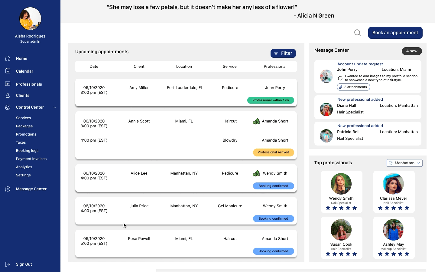
Final design for homepage

Final design for appointment details

Final design for calendar
TESTIMONIALS
See what my peers and my manager have to say about me:

Aisha Rodriguez
Product Manager
Swarada's strong points lie in her dynamic designs and critical thinking. She thinks outside the box and understands how important it is to understand a client's needs.
She exceeds all the expectations. Her work ethic and talent is phenomenal.
OUR NEW PLACE
I'm a paragraph. Click here to add your own text and edit me. Let your users get to know you.
REFLECTIONS
1
Collaboration is key.
Even though the team was working on different aspects of the dashboard, we all sat down for brainstorming together. The feedback that I got on my designs was very helpful in terms of direction. Weekly design sprint meeting with the engineering team and PM probed me to inspect the feasibility of my ideas even before presenting and that helped me grow as a designer.
2
There is no such thing as more than enough documentation.
Initially, working remotely was a bit of a challenge for me when it came to collaborating with the team and communicating my ideas. But, it forced me to document all my steps and ideas in detail so that I could present my progress to the team effectively. I learned that documenting even discarded ideas can lay a strong foundation in explaining your design decision to the design as well as the engineering team.